Can graphing really help you sell more homes?
 Maybe. In the past I’ve written about how a sales graph can help you show your expertise to your clients. Today I wanted to talk about graphing a little more but focus on how it can also help an agent sell more homes.
If you’re wondering how a graph can help you sell more homes stick with me for a minute and I’ll explain myself. The MLS systems available to most real estate agents have a ton of helpful information. The challenge is how to use that data in our day to day work to help make our job easier.
The data available through the MLS that I believe can be helpful involves information that the appraiser also looks at and reports in their appraisal reports. It is the “predominant age” and “predominant price” of the homes in the neighborhoods and market areas that we work in.
What’s predominant?
The predominant age and predominant price for a neighborhood, or “competitive market area”, is a measurement of the age and price of homes that are occurring the most. Lenders like to know these statistics to see if the collateral of their loans is over or underbuilt for the area, which can help them determine how difficult it might be to sell a home if it is foreclosed on. Don’t you think it would be harder to sell a $600,000 home in an area where the predominant price of the homes are in the $350-$400,000 range?
The predominant age and price statistics can also be helpful to an agent since it can tell them what age range of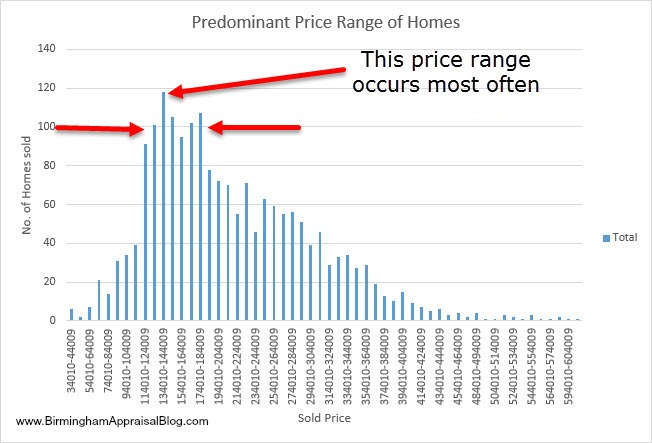 homes and price range most buyers are interested in purchasing. By knowing that 60% of the homes that people are buying are between $150,000 and $175,000 and are 10 to 15 years in age then by focusing on selling these types of homes you have a larger pool of potential buyers and a greater chance of selling a home that these people want to buy.
How to get this information
Information regarding the predominant age and prices of homes is available through most MLS services. Many multiple listing services provide sales statistics and may already have this information broken down for you, but if they don’t then you can get it yourself with a program like Excel, and involves the following steps:
- Downloading MLS sales data within the area you are working in over a specific time period.
- Organizing the data so that it includes both the age of the homes sold and the sales price.
- Analyzing and graphing the data in such a way that it tells you what age and price range of home are predominant.
Breaking down the steps
- Downloading the data- Most MLS services have the option of allowing you to download sales data into a spreadsheet program. I use Excel but any spreadsheet program that can import data in a CSV format will work such as Google Sheets which also works well. While you may want to include other data for other statistical analysis all you need for the study of predominant age and sale price is the year built/age and sales price.
- Organizing of data- As I noted above, the MLS data will most likely have the year built but may not have the age. You can calculate the age of each of the sales quickly because you’ll need it rather than the year built. The sales price should be in the format you need it to be.
- Analyze the data- This is where knowing how to use Excel will allow you to analyze large amounts of data in a short amount of time. While it may seem difficult at first, once you have done it a couple of times the process is quick and painless.
I put together a short video to show you how graphing the data works:
Once you have the data displayed you can visually see which age or price range is occurring the most. By focusing your sales efforts on those homes that are in the price range and age range that are occurring the most there is a chance that you will have more success. I hope that this information has been helpful to you as I am always looking for ways to assist agents by sharing with them the how’s and why’s of appraising as well as the tools we use that may be helpful to them.
This article is not a detailed Excel tutorial but rather a simple description of how you can use it to look at the data in order to help you become a more effective real estate agent. I hope the included video will give you a better idea of how this is done.
Question
Do you have anything else to add about how graphing or using Excel can help an agent sell more homes or be more knowledgeable for their clients? If you have a story please leave a comment below and let’s keep the conversation going. As always, thanks for reading.
If you liked this post subscribe by email (or RSS feed). Thanks for visiting.
If talking trends, don’t forget the motivation behind them. / Try this graph on for size; The new deal is we live in a pump and dump economy. Advise accordingly. / https://robertnielsen21.files.wordpress.com/2013/04/ci6rr.jpg
In my mind graphing is an absolute game-changer. I think many times this important message falls on deaf ears though because it can feel scary to learn a new skill. Or we feel so busy that learning something new seems daunting. I know for certain graphing changed the course of my business and the way I see the market. I would highly recommend others to listen to Tom. Put in the time to learn and see what it can do for you.
Thanks Ryan. As I stated in this post I think agents can learn a lot from graphing as well AND set themselves apart from the competition since no one really does it.
Another great post and video Tom. The human brain does not process large amounts of data easily. Using charts, tables, and graphs are a great way to visualize the market and communicate that information.
Agreed Gary. When you think about having several hundred records to analyze it can be overwhelming but Excel, or another spreadsheet program, is great for that.
Nice video for the agents Tom and anyone wanting to get their feet wet with Excel. Good job on using the group function as well. The one item I would mention is to run your age formula off of the closed date vs current year. 🙂
Thanks Wendell. Great suggestion on the closed date.